I’ve been super impressed with how easily the publicly available “Frontend-Design” skill generates well thought out website design that is both responsive for mobile resolutions, and follows design best practices. Skills are one of the most effective way to add specialist knowledge to Claude, and the publicly available skills bundled with Claude Desktop have some good starting points to interact with. Find yours under Settings > Capabilities.
The Goal
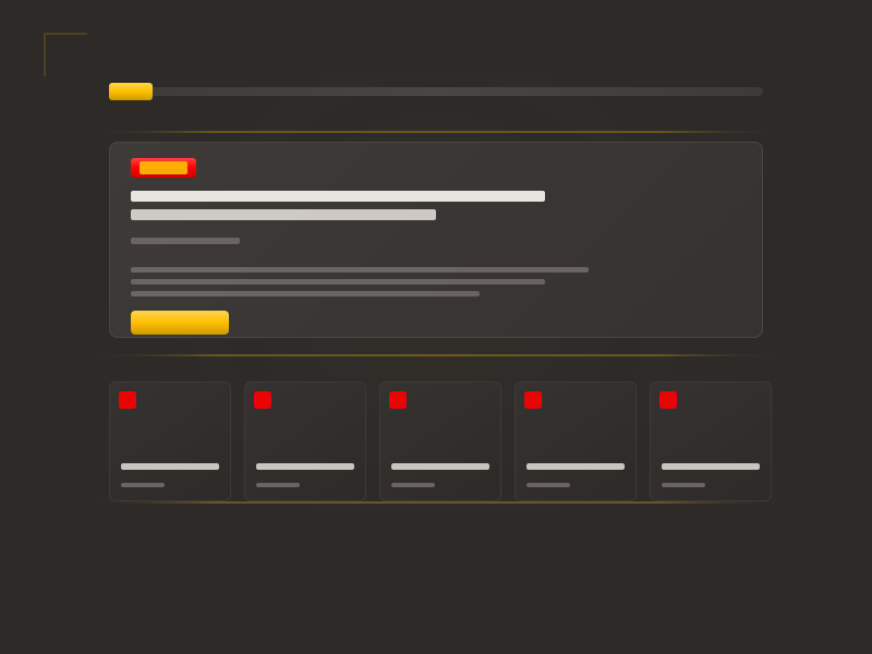
I wanted a homepage template for this blog that captured the warm, refined aesthetic of Claude Desktop—the same warm grays, the same sense of editorial polish. The template needed a header with logo, search, and navigation; a hero section for the latest post; and a grid of recent posts below. I had specific accent colors in mind: red (#ff0000) and gold (#ffbf00).
Rather than describe this piece by piece across multiple prompts, I decided to front-load everything into a single detailed request.
Prompt 1: The Kitchen Sink
In this session, we're going to use your front end skill to design a blog template. The blog should have a header section with a logo on the left, a search field in the middle, and a menu on the right.

The homepage should have a hero section which highlights the most recent blog post with a larger title, date published, an excerpt of the content, and a link to read the full post. Below that, the next 9 posts should be displayed in chronological order, with their linked titles and date published only.

This template should take inspiration from the Claude Desktop design. It should feature the same warm gray color background, and use a modern serif Font from the Google Fonts directory for headline text. It should use a similar warm off-white for the body text, and a clean soft sans-serif for the non-headline text. It should use subtle lines and borders where appropriate.

Strong accent colors will be #ff0000 and #ffbf00. Subtle gradients of those two colors may be generated as design accents if needed.

Let's begin there.
That’s about 150 words covering layout structure, typography direction, color palette, and design inspiration—all in one prompt.
What Claude delivered: A complete HTML file with embedded CSS. Header, hero section, 10-post grid, footer. Typography using Crimson Pro (serif headlines) and DM Sans (sans-serif body)—both solid choices I hadn’t specified by name. The warm gray palette was well-executed. Claude even added a subtle noise texture overlay to match the Claude Desktop feel, which I hadn’t asked for but appreciated.
The first output was roughly 80% correct. That’s the payoff of front-loading detail: you skip several rounds of “also add this” and “I forgot to mention.”
But there was a problem.
The Gradient Misinterpretation
I had written: “Subtle gradients of those two colors may be generated as design accents if needed.”
Claude interpreted this as: blend red and gold together into a single gradient.
What I meant was: create depth gradients within each color—lighter and darker shades of red for one element, lighter and darker shades of gold for another.
The difference matters. A red-to-gold gradient is aggressive and draws attention. A gold-to-deeper-gold gradient adds subtle dimension without screaming.
“Gradients of those two colors” is ambiguous. It could mean red-to-gold blends, or it could mean depth gradients within each color individually. When describing visual concepts, be more specific than you think you need to be.
This is a misinterpretation, and it’s the first issue type in the taxonomy I use to document these sessions. But here’s the thing: it wasn’t Claude’s fault. My phrasing was genuinely ambiguous. “Gradients of those two colors” could reasonably mean either interpretation.
Prompt 2: Owning the Ambiguity
This layout is perfect. I think I may have given you some ambiguous instruction, however.

For the accent color gradients (`#ff0000` and `#ffbf00`), I meant that a subtle gradient could be made of each of them individually, not combining the two for a gradient. The 50% red and amber gradient is aggressive, and not subtle at all.

Revise this design with the following tweaks:

Primary accent color: `#ffbf00`

Create a subtle gradient using this color which adds a little depth with highlight and shadow. Use the solid color for linked text. Use the gradient for any sort of button.

Secondary accent color: #ff0000

Create a subtle gradient using this color which adds a little depth with highlight and shadow.
Use the solid color as the secondary accent for things like the post-number label. Use the gradient as the background for any filled labels, like hero-category display.
Notice what this correction does:
- Acknowledges my role: “I think I may have given you some ambiguous instruction” reframes this as collaborative debugging rather than “you got it wrong.”
- Explains what I actually meant: Not just “that’s wrong” but “I meant X, not Y.”
- Provides detailed guidance: Specific instructions for each color—where to use solid vs. gradient, which is primary vs. secondary.
When correcting Claude, acknowledge if your original prompt was unclear. Explain what you actually meant, not just what went wrong. Provide specific guidance for each element that needs to change. This reframes the interaction as collaborative debugging rather than blame—and gets you to the right result faster.
Claude understood immediately and revised the CSS. Gold became the primary accent with light-to-deep gradients for buttons. Red became a secondary accent used sparingly. The result was much more refined.
But I caught one more thing.
Prompt 3: The Small Tweak
Oh, one final tweak: the hero-category label should still be using the primary accent color (#ffbf00) for the text. It should continue to use the red gradient you've shown for the background.The hero category label had red text on a red background—low contrast and missing an opportunity to pair both accent colors. I wanted gold text on the red background.
This is another misinterpretation, but a minor one. I hadn’t specified how the two colors should interact on the same element. Claude made a reasonable assumption (red element = red text). I had a specific vision (red background + gold text for contrast and dual-accent harmony).
Claude made the targeted edit—just the color property on .hero-category, nothing else touched.
Claude uses str_replace for targeted edits rather than regenerating entire files. This preserves working code and makes changes easy to review—but it means your correction needs to be specific about which part to change.
Prompt 4: Done
This is perfect.Four exchanges. One initial prompt, two corrections, one confirmation. A complete, polished homepage template.
What This Session Teaches
Front-loading works. The detailed initial prompt meant Claude’s first attempt had the right structure, typography approach, and overall aesthetic. The corrections were about refinement, not rebuilding.
Design terminology is ambiguous. “Gradient of two colors” and “gradients using each color” mean different things, but both are valid interpretations of “gradients of those two colors.” When working with visual concepts, be more specific than you think you need to be.
Own your ambiguity. When Claude misinterprets something, consider whether your prompt was clear. If it wasn’t, say so. “I may have given you ambiguous instruction” is more productive than “that’s not what I asked for”—it keeps the collaboration constructive and makes Claude more receptive to the correction.
Corrections should explain, not just reject. “That’s wrong, fix it” forces Claude to guess what you want. Explaining what you actually meant—with specific guidance—gets you there faster.
Small corrections are normal. Three to four iterations for a complete template isn’t failure; it’s the process working. The path is rarely a straight line from prompt to perfect output.
The path from prompt to perfect output is rarely a straight line. Three to four iterations for a complete, polished template isn’t failure—it’s the process working as intended.
Issue types in this session: misinterpretation (×2)
Skills used: frontend-design