Claude is most definitely NOT a Nano Banano or the like, and realistically, if you want to do full image generation, you should probably use a model specifically designed for that. But, in the course of my research and experimentation, I wanted to find out two things:
- What is Claude actually capable of from a graphics generation perspective?
- Is Claude capable of becoming more sophisticated with this ability over time, with training?
The answer to the first question is, a surprisingly large amount. I have generated a number of usable graphics, and some very high quality and aesthetically pleasing animated SVGs. The answer to the second question is ongoing, and you can watch the progression of featured images on this site to see the evolution. So far, in five posts, I am already seeing a marked improvement in its ability to synthesize the content of the post, suggest high level concepts, and render graphics based on that content.
But, it took some work to get there. Read on.
Every blog needs featured images. I wanted to see if Claude could generate them directly, based on post content and site aesthetic. The result was a lesson in knowing where Claude’s strengths actually lie—and when to abandon an approach that isn’t working.
The Setup
I gave Claude the context: the site’s color palette (warm grays, red and gold accents), the featured image dimensions from the WordPress theme (800×600), and the content of the Introduction post. I also included the logo graphic as a style reference—not to copy, but to demonstrate the geometric, angular aesthetic I was after.
My prompt framed this as experimental:
This is a wild experiment, so it may need lots of hand holding to get anything useful out of it.Setting that expectation turned out to be important.
The Figurative Attempt
Claude analyzed the Introduction post’s themes—skeptic to discovery, the pivot moment, learning in public—and proposed five concept directions. I chose “Threshold”: a silhouette figure from behind, facing a golden doorway. Classic imagery for a journey narrative.
The first render was… not good. The hat looked like a bowler instead of a fedora. The figure read more like a tombstone than a person. The “light through doorway” was a vertical gradient stripe inside the door shape rather than light radiating outward.
I asked Claude to try SVG instead of CSS-based rendering. The second attempt was marginally better but still failed: the hat was malformed, the body looked like “a coat on a hanger,” and the light still wasn’t convincing.
Claude constructs shapes mathematically rather than understanding them visually. The gap between “knowing what a fedora should look like” and “expressing it in SVG paths” is significant for figurative work. This isn’t a prompting problem—it’s a capability boundary.
After two failed attempts, I named what was happening:
It's clear that you're not a strong image model like Nano Banano, and I should note that when talking about your abilities.Claude agreed. We pivoted.
The Abstract Pivot
I redirected toward abstract geometric concepts—Claude’s demonstrated strength from previous work on animated network maps. Same color palette, same clean angles and crisp curves, but no attempt to represent people or objects.
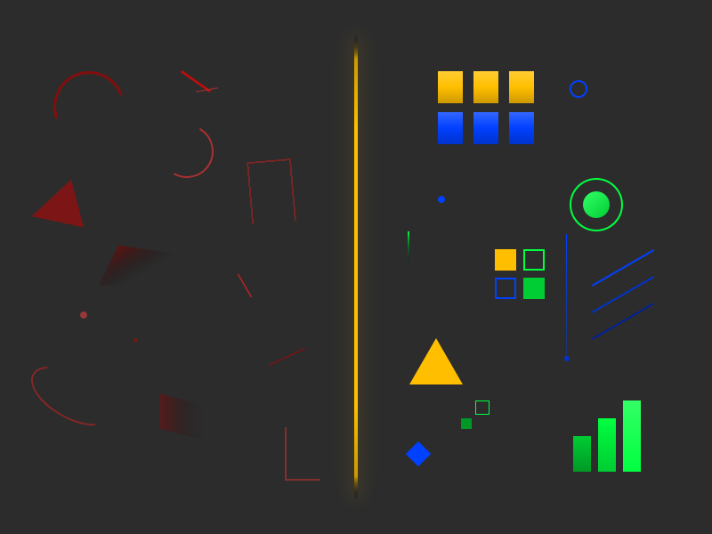
Claude proposed five new directions. I picked two to compare: “Convergence” (scattered shapes becoming aligned) and “Threshold” reimagined abstractly (a vertical line with mirrored dark/light shapes).
Both renders were usable but simpler than I expected from the descriptions. This revealed something important:
The description-to-output gap for images is significant. Generating multiple concepts before committing to iteration helps calibrate your expectations—you’ll learn what Claude’s descriptions actually produce.
I chose Convergence and started iterating. The first abstract version had randomly scattered shapes that didn’t feel intentional. I provided a reference image—a network map Claude had generated in a previous project—and said:
The graphic doesn't feel cohesive and intentional. I wonder if that's a problem that can actually be solved in this context.Reference images communicate “what good looks like” more effectively than verbal description alone. When words aren’t bridging the gap, show an example of the quality you’re after.
Claude analyzed what made the reference work: consistent visual language, connection creating cohesion, purposeful color use, implied depth, balanced asymmetry. The next version incorporated connecting lines between shapes. Significant improvement.
Iterating to Final
From there, iteration followed a normal feedback loop:
- More shards: I asked for many more shapes, scattered on the left, ordered on the right
- Color spectrum: Dark red → light red → gray → light gold → dark gold, representing chaos-to-order
- Shape consistency: Parallelograms became uniform rectangles
- Transition columns: Added red-to-gray and gray-to-gold gradient zones
- Alignment refinement: The pre-grid particles needed to align with the locked grid rows to create a “snap into place” effect
Each request built on the previous version. Claude made targeted edits rather than regenerating from scratch. Five iterations in the abstract phase produced a polished 800×600 image that captured the Introduction post’s narrative arc.
Knowing when to pivot saved this session. Two failed figurative attempts could have become a spiral—continuing to iterate on something that wasn’t converging. Recognizing the capability boundary and redirecting to Claude’s strengths turned a potential failure into a successful workflow.
What This Means for Featured Images
The session established clear guidelines:
Claude can do:
- Abstract geometric compositions
- Clean shapes, sharp angles, crisp curves
- Intentional use of color palettes and gradients
- Spatial relationships that convey concepts (chaos→order, connection, transformation)
Claude cannot do:
- Figurative illustrations (people, objects, scenes)
- Organic shapes that require visual understanding
- Anything where “looking right” depends on matching real-world expectations
For featured images, stay in the abstract zone. Concepts like “convergence,” “threshold,” “layers connecting,” or “signal emerging from noise” translate well. Concepts like “person walking through door” or “hand reaching for light” will fail.
The Numbers
- Total prompts: 10
- Figurative phase: 3 prompts, failed, pivoted
- Abstract phase: 7 prompts, successful
- Image files generated: 9 (documenting the iteration)
- Final image: Abstract red-to-gold spectrum with rectangles progressing from scattered to grid-aligned
The figurative detour wasn’t wasted time—it established the boundary clearly. Now I know not to ask Claude for detailed realist illustrations, and the blog can document that honestly for readers trying to understand what’s achievable.